A flexible inline pill component for announcements, badges, and call-to-action elements with SVG borders, gradient variants, glass backgrounds, and comprehensive customization options.
A collection of animated background effects for the primary CTA section. Great for adding visual interest to your landing page and making it more engaging.
A comprehensive price comparison component that allows you to compare features across 2-5 products or services with customizable headers, footers, and feature lists.
A component for displaying app store download buttons on landing pages. Supports iOS App Store, Mac App Store, Microsoft Store, and Google Play Store with white and black variants.
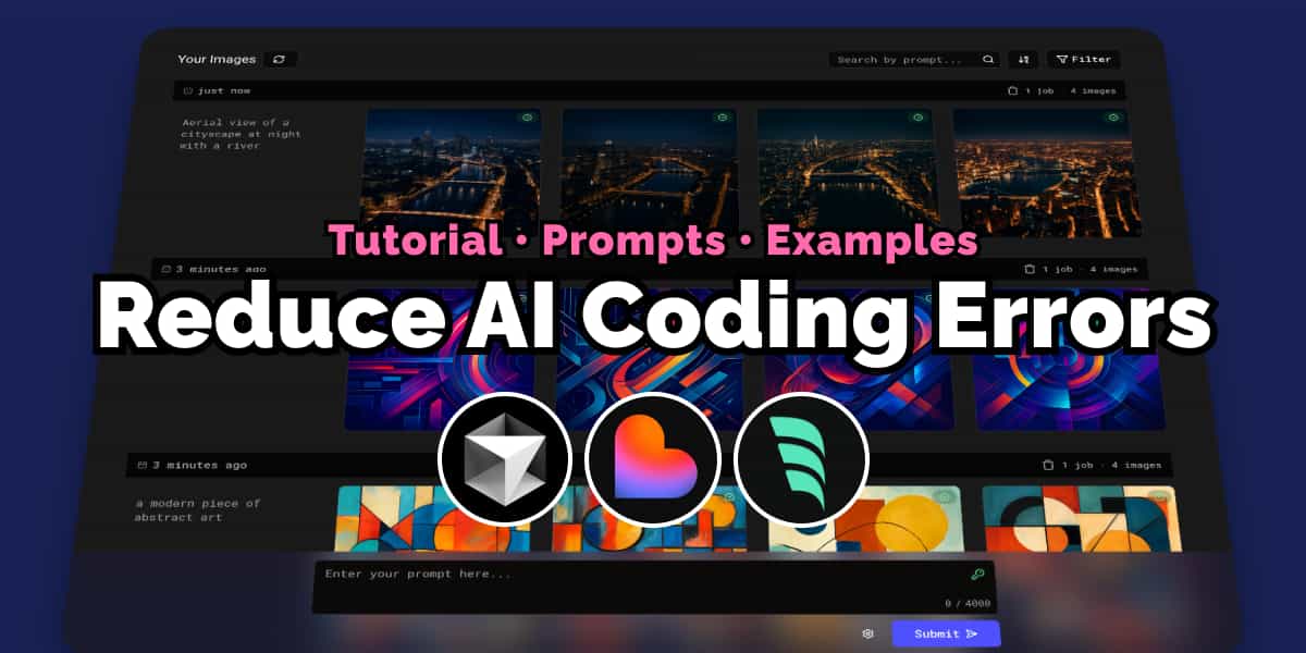
How to Reduce AI Coding Errors with a Claude TaskMaster AI, a task manager MCP
Published on
Learn how to set up a task manager MCP server (Claude TaskMaster AI) to reduce AI coding errors in Cursor, Windsurf, Lovable. Write a PRD, analyze complexity and break down tasks.
A component meant to be used for landing page pricing plan display with features and a call-to-action button. On smaller screens, the layout becomes a single column to ensure usability.
A component meant to be used for the footer on the landing page. It provides additional information and links related to the website, organized in columns. On smaller screens, it changes to a horizontal layout to ensure usability.
A component meant to be used for a newsletter subscription on the landing page. It allows users to enter their email to subscribe to updates. On smaller screens, the input field may adjust accordingly.
A component meant to be used as navigation / header in the landing page. It displays a top navigation bar with a main menu and a logo. On smaller screens, the main menu is hidden and a hamburger menu is displayed instead.
A component meant to be used in the landing page. It displays a list of features and content corresponding to each, creating a product tour. Useful to showcase many features in a compact way and guide the user through the product.
Set Up a $4/mo Hetzner VM to Skip the Serverless Tax
Published on
With a little effort, you can set up a virtual machine (VM) on Hetzner for just $4/mo with SSL, DNS, a domain, and a web app. Learn how using Caddy, Cloudflare and Github.
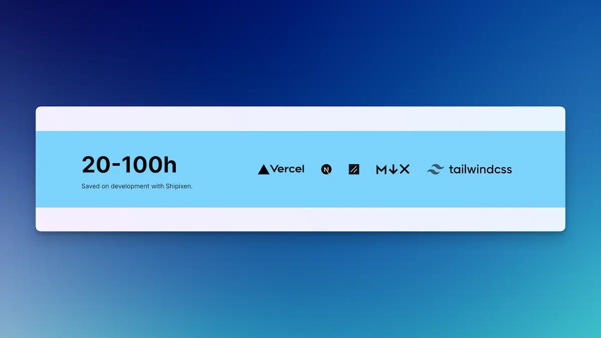
A component meant to be used in the landing page. It displays text and a grid of logos/images, optionally showcasing the companies that use the product, integrations etc.
Deploying a Shipixen or Next.js website to Coolify Cloud
Published on
Deploy your Shipixen-generated or any Next.js app too Coolify Cloud; self-host your Next.js site on a VPS instead of Verce, Netlify, or other cloud providers.
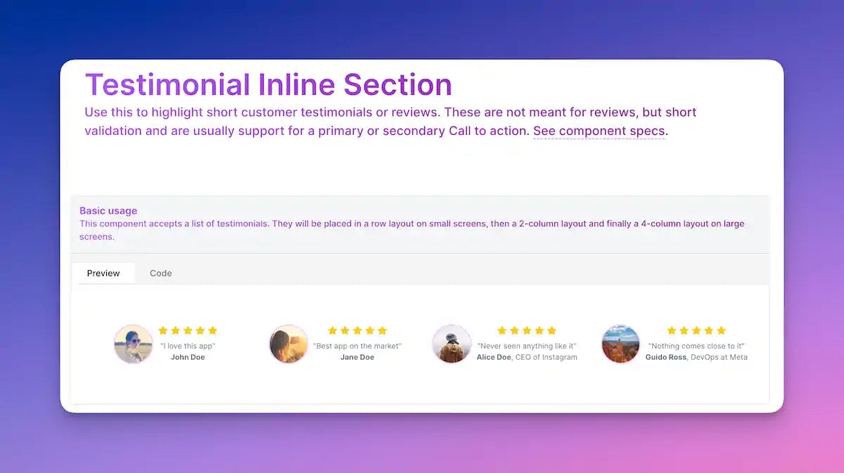
A component meant to be used in the landing page. It displays a single testimonial inline. Use this to highlight short customer testimonials or reviews. are meant as short validation and are usually support for a primary or secondary Call to action. Can be used with Testimonial Inline.
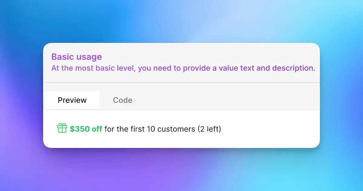
A component meant to be used in the landing page. Use this to show a discount or offer to encourage users to take action, typically used under call to action buttons.
Landing Page Primary Image Call to Action (CTA) Component
Published on
A component meant to be used in the landing page. A section that shows a title, description and an image. Optionally, it can have actions (children), leading components and a background glow.
Landing Page Primary Text Call to Action (CTA) Component
Published on
A component meant to be used in the landing page as the primary Call to Action section. A section that shows a title & description. Optionally, it can have actions (children) and a background.
A component meant to be used in the landing page. It displays a title, description and a grid of LandingProductFeature and/or LandingProductVideoFeature (in any combination, passed as children).
A component meant to be used in the landing page. It displays a title, description and video of a product's feature. The video could either be left, right or center (larger). The section can have a background or not.
A component meant to be used in the landing page, as a child of Social Proof Band. Shows a social proof/key feature/milestone item with an optional graphic.
A component meant to be used in the landing page. Highlights important features, milestones or testimonials of your product. Use this to highlight key features or social proof. This is usually placed at the top of the page, but you can also use it in between sections or below your primary CTA.
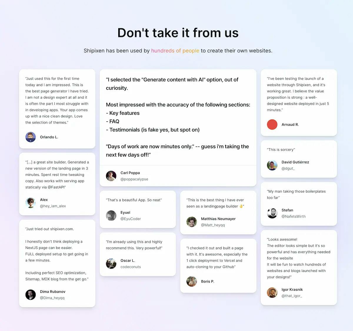
A component meant to be used in the landing page. It displays a grid of short testimonials. Use this to highlight short customer testimonials or reviews. These are not meant for reviews, but short validation and are usually support for a primary or secondary Call to action.
Adding a knowledge base or documentation hub to your Shipixen template
Published on
The Shipixen blog can be used as a knowledge base or documentation hub. This guide will show you how to add a knowledge base or documentation hub to your Shipixen template.
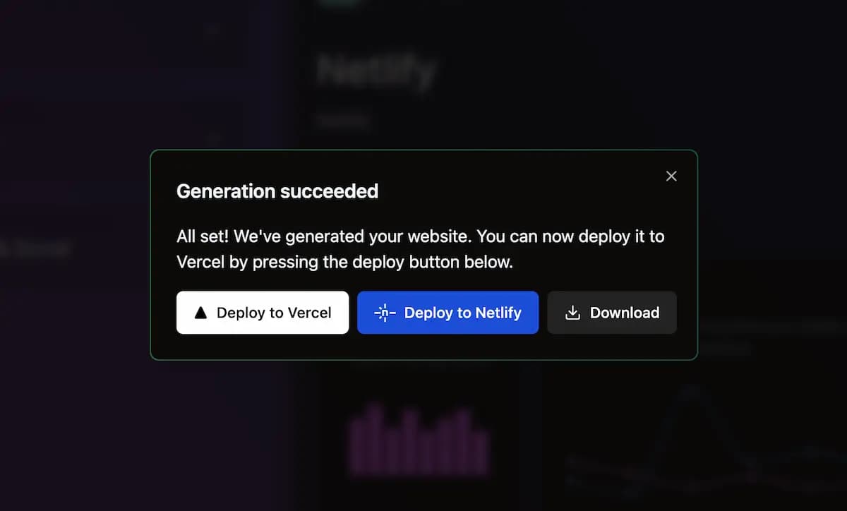
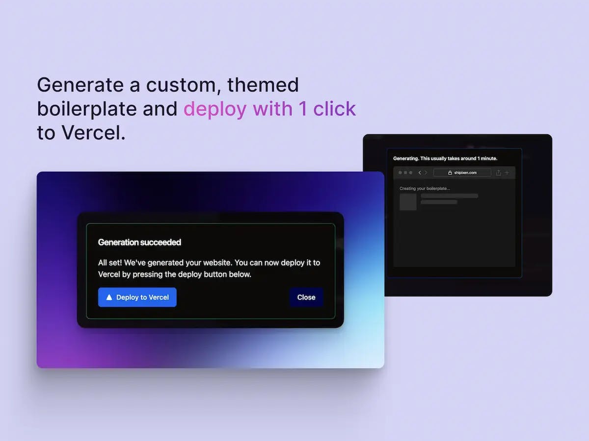
Shipixen supports importing blog posts from json to a file-based markdown blog. Here is how you can do that. The best part is you can deploy your blog to Vercel with a single click afterwards.
Shipixen will get you started with a solid foundation in no time. However, these tools will help you keep the momentum going after you launch your first version.
This component is used to display a product feature in the landing page. It can show an image on the left, right or center; either in perspective or flat and has many customization options
A component meant to be used in the landing page. Use this to highlight customer testimonials or reviews as a grid. Each testimonial has text, a name, and a picture of the person.
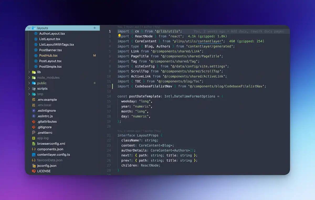
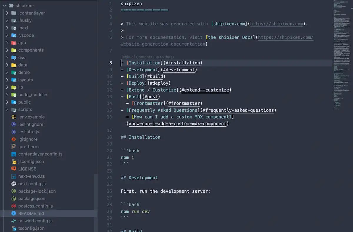
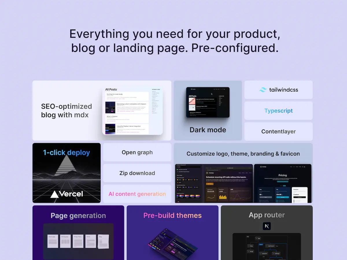
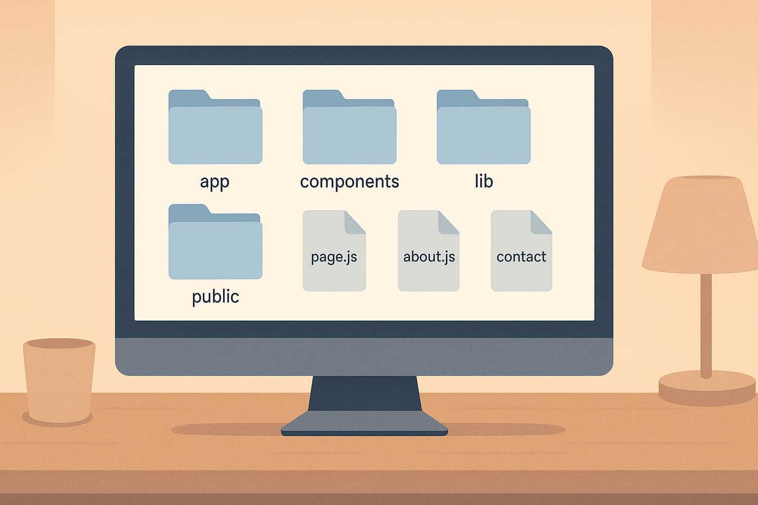
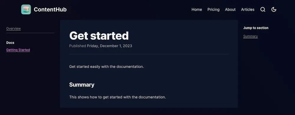
The starting point for learning how to generate a website & blog with Shipixen, as well as an overview of the codebase, components, tools and deployment
Creating a custom React component to use in the (mdx) blog
Published on
Learn how to create a custom React component that can be used in the blog. Custom components can be used to create reusable sections in the blog as well as interactive components.
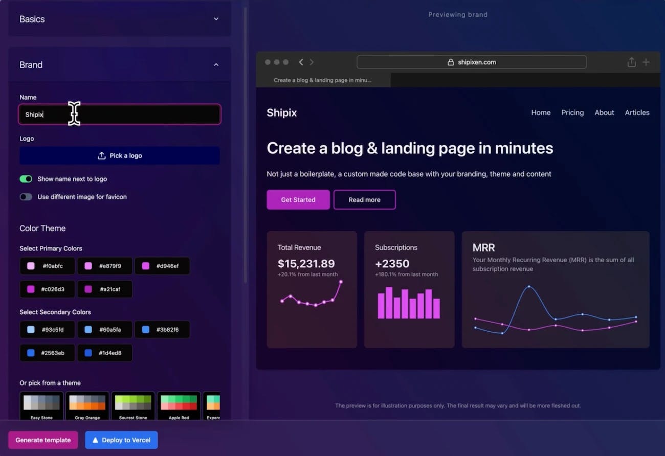
Shipixen can generate boilerplate with your branding and custom configuration. This is the starting point for learning how to generate a website & blog with Shipixen, as well as an overview of the codebase and components
Setting up analytics with Posthog in your Next.js / Shipixen app is easy and straightforward. This guide will walk you through the process step by step.
Setting up analytics with Vercel is pre-configured and easy to use. In this tutorial, we will walk you through the process of setting up analytics with Vercel in your Next.js / Shipixen app.


