
Product Card
- Updated on
The Product Card Section component is designed to showcase products in a responsive grid layout with customizable columns. It's perfect for e-commerce sections, featured products, or any collection of items that need to be displayed in an organized grid format. The component supports both programmatic usage with an array of products and declarative usage with children components.
Featured Products
Browse our collection of featured products
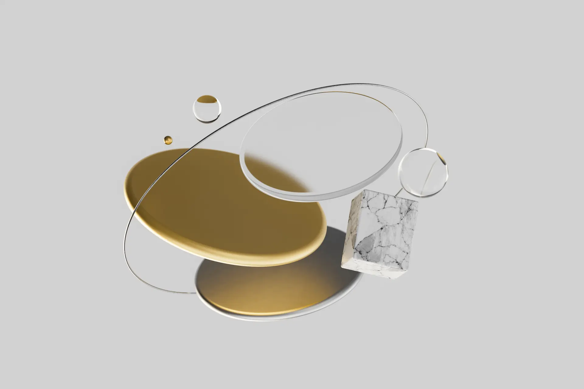
Eco Chair
Chair constructed from beech wood with a plywood back. The seat can just be upholstered or the seat and back rest as well.
Modern Desk
Minimalist desk with solid oak frame and tempered glass top.

Lounge Sofa
Comfortable 3-seater sofa with premium fabric upholstery.
Usage
import { LandingProductCardSection, LandingProductCard } from '@/components/landing/product';
<LandingProductCardSection
  title="Our Products"
  description="Explore our collection"
  products={[
    {
      title: "Product 1",
      description: "Description of product 1",
      imageSrc: "/static/images/backdrop-1.webp",
    },
    // ... more products
  ]}
/>
Examples
Four Column Grid
Display products in a 4-column grid for a more compact layout.
Featured Collection
A selection of our most popular items

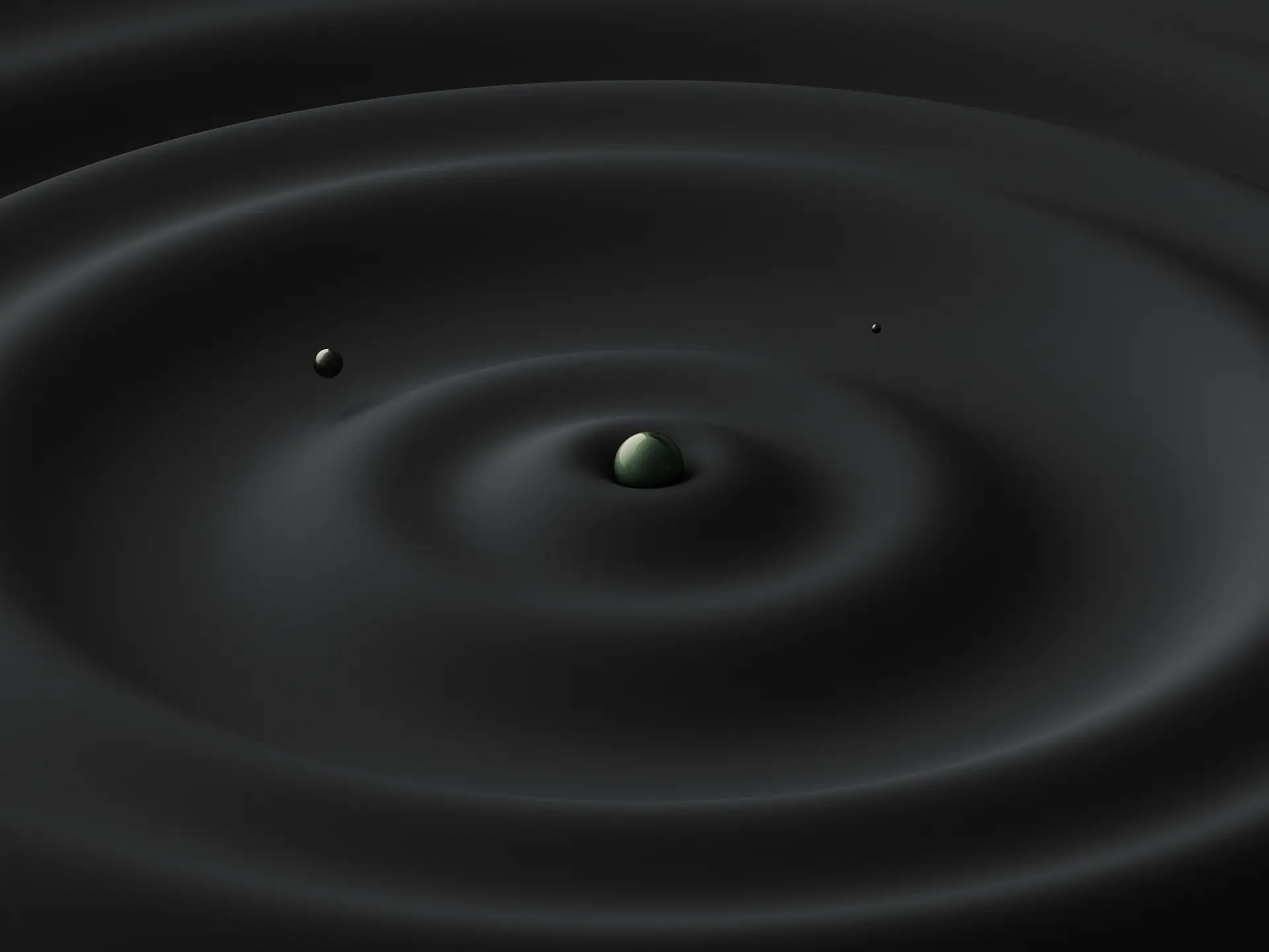
Side Table
Compact side table with marble top.

Floor Lamp
Adjustable floor lamp with linen shade.

Bookshelf
Modular bookshelf with adjustable shelves.
Desk Chair
Ergonomic desk chair with breathable mesh.
Component-Based Usage
You can use the component-based approach by providing child LandingProductCard components directly. This allows for more customization and flexibility.
Product Collection
Handcrafted with attention to detail
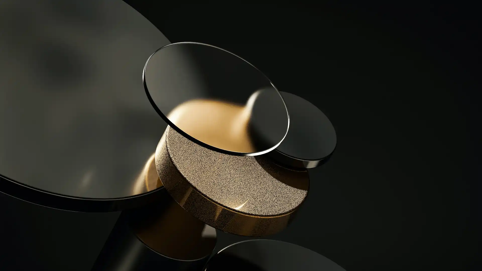
Wooden Table
Handcrafted oak dining table with natural finish.

Ceramic Vase
Hand-thrown ceramic vase with unique glaze pattern.

Wall Sconce
Modern wall sconce with adjustable arm and warm lighting.
With Background
Premium Collection
Our finest selection of premium products

Leather Armchair
Premium leather armchair with walnut frame.

Pendant Light
Handblown glass pendant light with brass accents.

Area Rug
Hand-knotted wool area rug in natural colors.
Custom Card Components
Demonstrate using the topComponent and bottomComponent props to add custom content to the product cards.
Custom Product Cards
Featuring custom component slots for flexible layouts

Premium Chair
Ergonomic office chair with adjustable height and lumbar support.

Standing Desk
Height-adjustable standing desk with memory presets.

Desk Lamp
Adjustable desk lamp with wireless charging base.
API Reference
LandingProductCardSection Props
| Prop Name | Prop Type | Required | Default |
|---|---|---|---|
| title | string | No | - |
| titleComponent | React.ReactNode | No | - |
| description | string | No | - |
| descriptionComponent | React.ReactNode | No | - |
| products | ProductCardProps[] | No | [] |
| children | React.ReactNode | No | - |
| className | string | No | '' |
| innerClassName | string | No | '' |
| gridClassName | string | No | '' |
| gridColumns | 3 | 4 | No | 3 |
| withBackground | boolean | No | false |
| withBackgroundGlow | boolean | No | false |
| backgroundGlowVariant | 'primary' | 'secondary' | No | 'primary' |
| variant | 'primary' | 'secondary' | No | 'primary' |
| textPosition | 'center' | 'left' | No | 'center' |
LandingProductCard Props
| Prop Name | Prop Type | Required | Default |
|---|---|---|---|
| title | string | Yes | - |
| titleComponent | React.ReactNode | No | - |
| description | string | No | - |
| descriptionComponent | React.ReactNode | No | - |
| imageSrc | string | No | - |
| imageAlt | string | No | '' |
| actionComponent | React.ReactNode | No | - |
| topComponent | React.ReactNode | No | - |
| bottomComponent | React.ReactNode | No | - |
| featured | boolean | No | false |
| className | string | No | - |
| variant | 'primary' | 'secondary' | 'default' | No | 'default' |
| href | string | No | - |
Type Definitions
export interface ProductCardProps {
  title: string;
  titleComponent?: React.ReactNode;
  description?: string;
  descriptionComponent?: React.ReactNode;
  imageSrc?: string;
  imageAlt?: string;
  actionComponent?: React.ReactNode;
  topComponent?: React.ReactNode;
  bottomComponent?: React.ReactNode;
  featured?: boolean;
  className?: string;
  variant?: 'primary' | 'secondary' | 'default';
  href?: string;
}
export interface LandingProductCardSectionProps {
  title?: string;
  titleComponent?: React.ReactNode;
  description?: string;
  descriptionComponent?: React.ReactNode;
  products?: ProductCardProps[];
  children?: React.ReactNode;
  className?: string;
  innerClassName?: string;
  gridClassName?: string;
  gridColumns?: 3 | 4;
  withBackground?: boolean;
  withBackgroundGlow?: boolean;
  backgroundGlowVariant?: 'primary' | 'secondary';
  variant?: 'primary' | 'secondary';
  textPosition?: 'center' | 'left';
}
More Examples
For more even more examples, see our Landing Page Component Examples page or see complete landing page examples by Exploring Our Landing Page Templates.
Also see:
- Product Feature component
- Pricing component
- Bento Grid component